

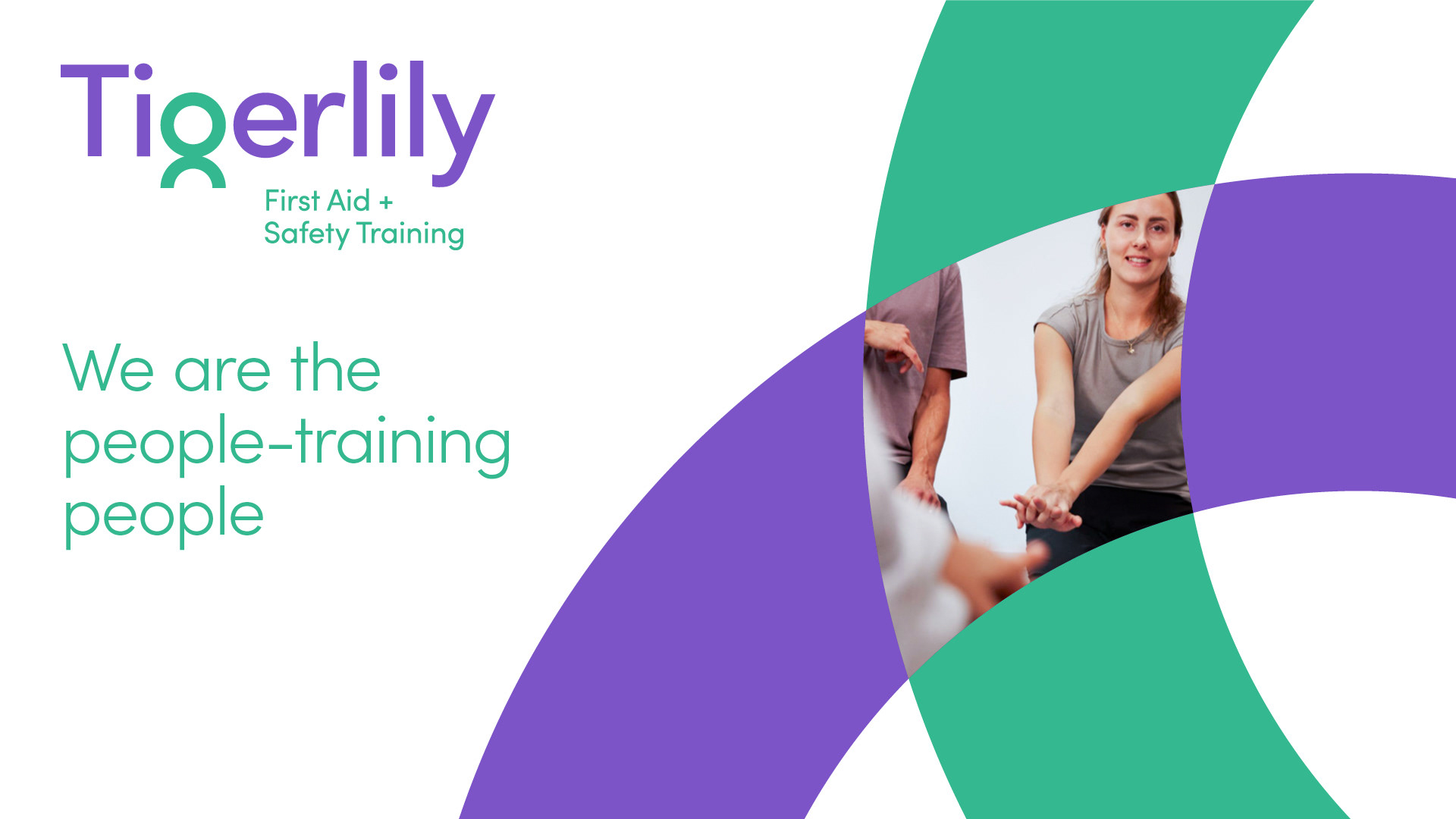
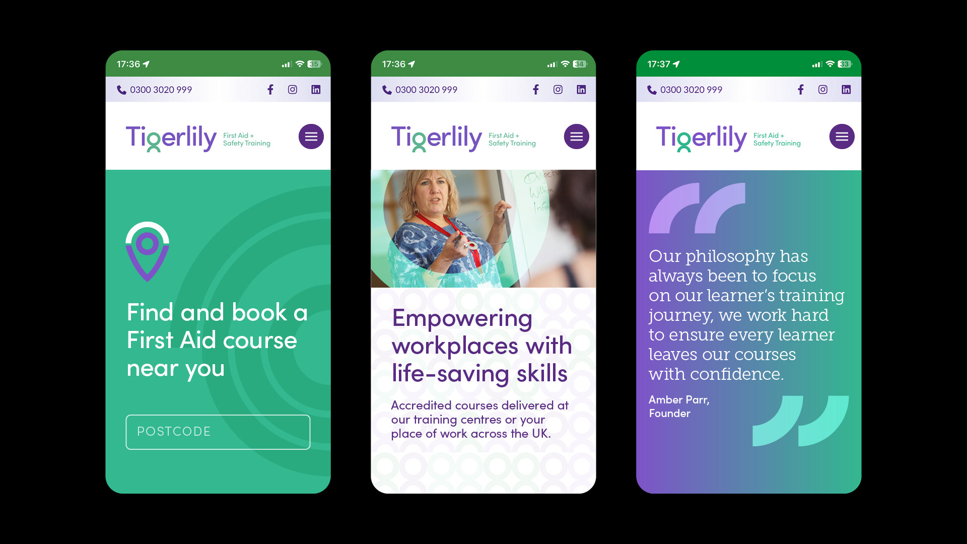
Brand evolution for a nationwide first aid and safety training business as it expanded into new sectors and broadened its course offering. The refreshed identity brings a sense of confidence and clarity. The new logo has evolved the former parent/child symbol in the ‘g’ character into a simplified figure, reinforcing Tigerlily’s people-first approach. Comprehensive guidelines and templates were developed to support consistent rollout across all communications.
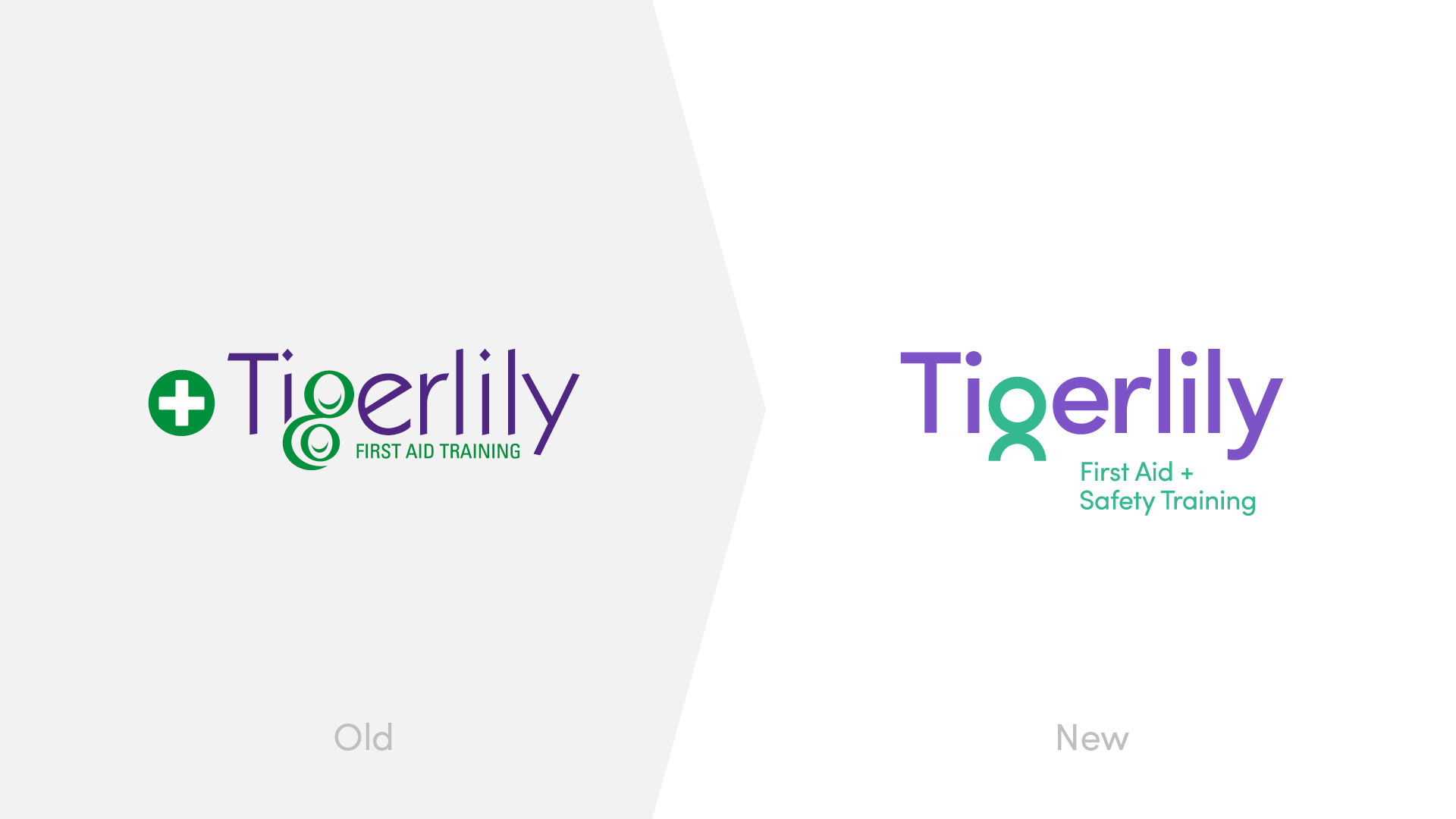
Logo evolution
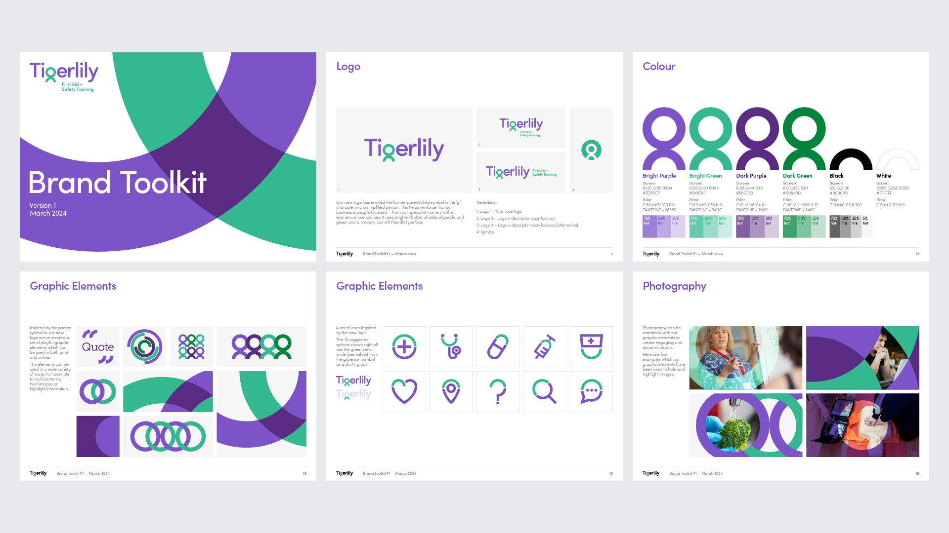
Brand guidelines
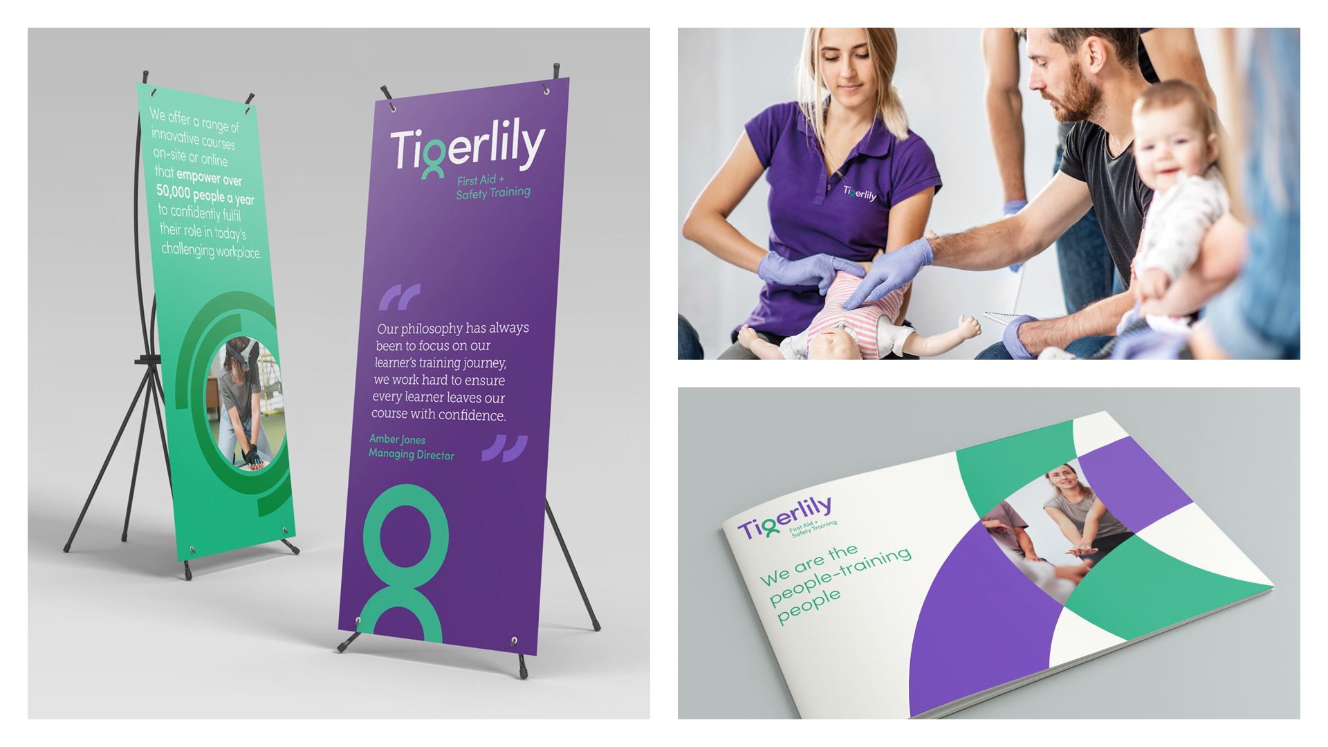
Brand applications
Website design guide