

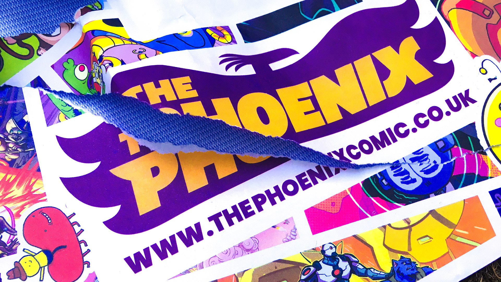
Brand refresh for The Phoenix, a weekly children’s comic. The brief was to increase news-stand appeal and broaden the audience while retaining the comic’s playful spirit. The project involved evolving the logo and typography, and developing guidelines that support consistency while allowing the in-house team to continue producing energetic, imaginative and exuberant issues.
Created on behalf of Baxter & Bailey (All images © Baxter & Bailey / The Phoenix)
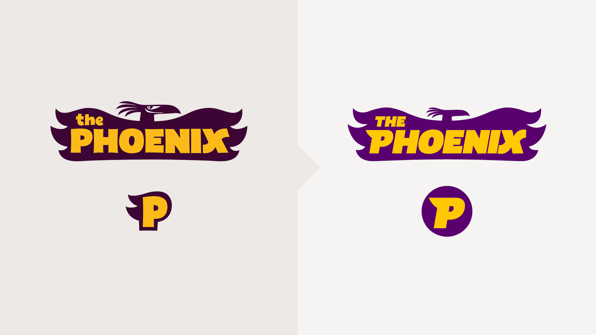
Logo evolution
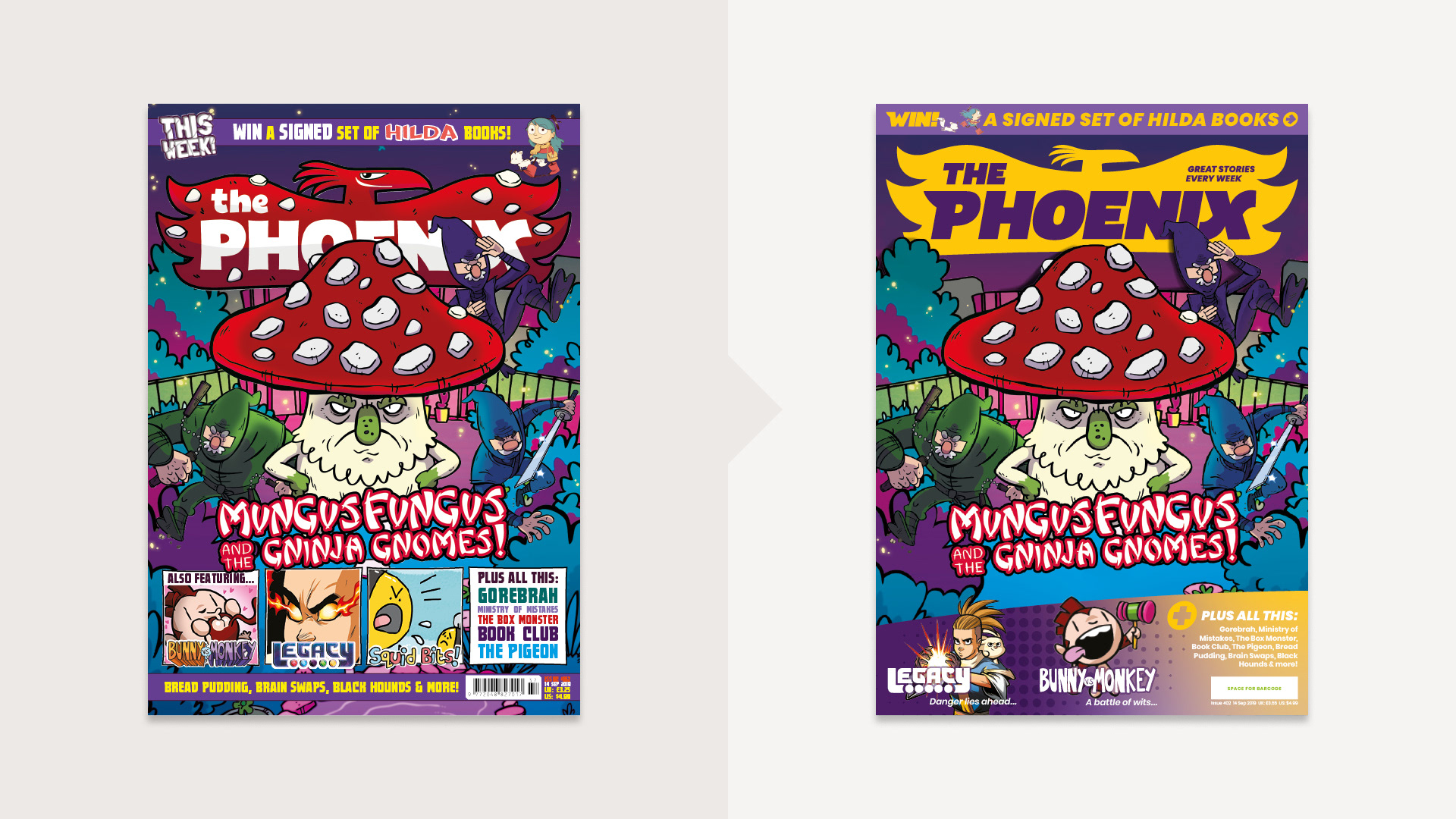
Cover design evolution
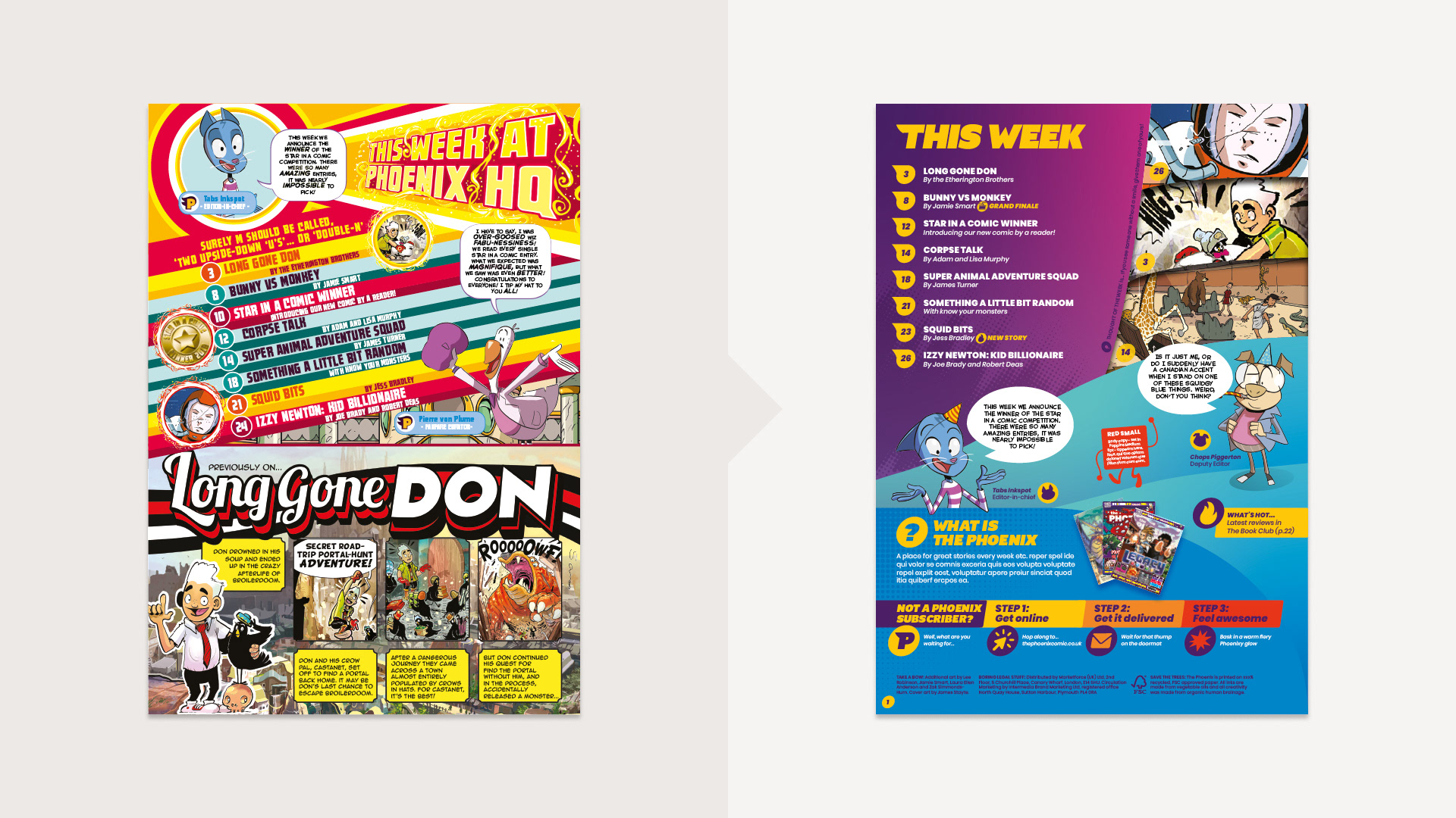
Contents page evolution
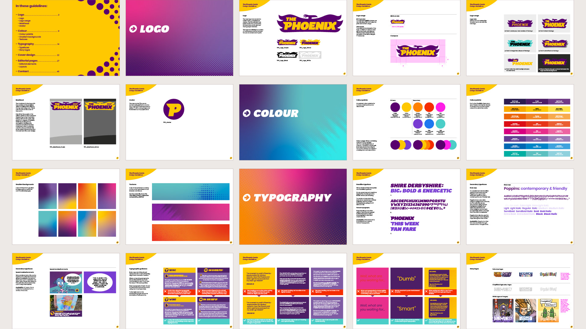
Brand/editorial guidelines 1/2
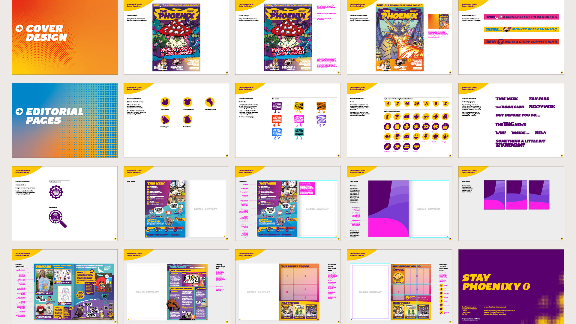
Brand/editorial guidelines 2/2
Disciplines: Branding / Typography / Editorial / Art direction / Illustration